วันพุธที่ 10 มิถุนายน พ.ศ. 2558

(Articles By Bakari Chavanu)

5 Basic Principles Of Graphic Design You Take For Granted Everyday
In the visual age of the Internet it’s relatively easy to create your own graphic designs, but they don’t have to look homemade.

Whether you’re designing a logo, an event announcement, a social network banner, a letterhead, or an email newsletter; you absolutely need to know five basic principles of graphic design. Graphic designer and best selling author Robin Williams explains these principles in her classic book, The Non-Designer’s Design Book.

Today we will be providing an overview of these principles using a few contemporary examples.

Proximity
Proximity means grouping elements together so that you guide the viewer/reader to different parts of the message. Notice below in the template on the left, taken from Apple’s Pages, related elements are grouped together, as opposed to the linear arrangement of amateur designs as shown on the right.


Though at first the elements may appear scattered, their proximity adds unity and continuity to the page. Even if you intend on sticking to templates, it still helps to know design principles for the purposes of customizing an existing design.
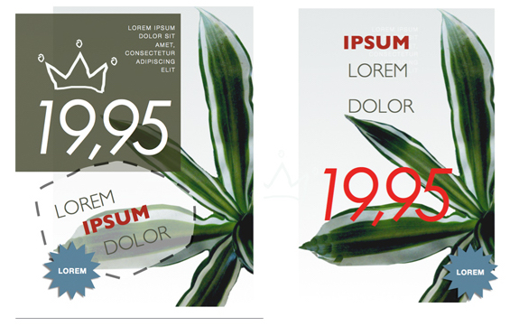
Alignment
Another important design principle is aligning elements in a visual and readable arrangement. Most amateur designers start off by aligning everything in the center of the page, but that’s not the only way. Again with the “scattered” looking design, we can see the alignment of elements that helps keep the design balanced. The top group of text is left-aligned, and three larger text elements are vertically aligned.
It’s important to be consistent in the alignment of elements. When you look at the design and something doesn’t feel right, play around with the alignment and see if the design can be improved.

Repetition
Like the use of repetitious hooks in a song, repeating elements in a graphic design can be visually appealing. In the two examples below, a numbered list is used, but there’s also the repetition of the blue circles that make a bolder statement.

In the layout on the right, the image of the sandwiched is cropped and masked in repeating squares, as well as the use of repeated red strokes above the word “PANE.” Repetition puts emphasis on particular elements of a design, and it draws the reader’s attention to those elements

Contrast
Contrast between design elements can make a presentation stand out and get noticed. Take for example this original template from the personal graphic design site, Canva.com. The elements of the design are grouped together, with strong alignment and repetition of  of the arrows and bullet points. But for some purposes, the original design could be a little flat.

Adding color contrast makes the design pop, and it draws attention to important parts of the presentation and message.

Notice another piece of contrast: the two arrows are followed by the check in the circle, which sends a visual message. The color of that element could also be changed to add contrast.

White Space
Depending on the presentation, the use of white space can be very powerful in design. It’s useful when you want to make a direct message, to stand out above the clutter found in many graphic designs. In this Canva business card template, the empty space helps bring clarity to the message.


Learning Graphic Principles
I’m not a graphic designer, but years ago I learned a lot from working through the exercises of Robin Williams’ book. Canva.com also provides several design tutorials that cover the above basic principles and several other design techniques. The site makes it easy for users to customize templates and save designs for later use.

Try your hand at applying the above principles to your next graphic design project, and let us know your thoughts, ideas, and tips for learning graphic design.


6. Space
The space and how it is used is crucially important in design. Lately the “white space” (also called negative space) became used widely because it allows the human eye to read easier. For whoever is not familiar with the term “white space”, it does not mean precisely space filled with white, but every area of the design which is only filled with the background color. You can see several examples below to better understand the concept.


If there is a lot of negative space in your web design, it offers light and an open feeling. The lack of white space will turn your design into an old-fashioned, cluttered one. The space has also a lot to do with how the design is perceived by the human eye.

Even if I said the color is maybe the most important element of a design, the space is definitely present in the top, because it is also very easy to notice by the untrained eye. It can turn a design to your advantage and get the best out of your layout.

Conclusion
These are the basic elements a beginner graphic designer should know about. Having this knowledge will allow you to think more user-focused and design with a better style. However, this is not everything. A couple of more articles will complete this series and the following one, due to come very soon, will talk about the principles of design.

Further reading
This article was just a list of the basic elements of a graphic designer. If you wish to learn more about them, I’ve gathered the following sources for you from the internet. Reading them entirely (and maybe more times) will give you a better understanding of the basic design process.

( via. 1stwebdesigner.com )
5. Value
I did not specify value above, even if it is closely related to color, because value is more general and represents how dark or light a design is. Value has a lot to do with mood too, only at a more profound level. Understanding colors will take you close to perfection, but knowing how value works will take you beyond this. Lighter designs offer a different impact and feeling than the dark ones and you need an expert eye to notice differences and decide which one is the best.

( via. 1stwebdesigner.com )
4. Color
The color may even be the most important element of a design, because it offers the most powerful visual impact at a single glance. Color is obvious and does not need basic graphic skills to be noticed. While lines and shapes mean the same thing as in the reality, only at a little more profound level, the color means exactly the same thing as in the nature. Color creates emotions – red is passionate, blue is calm, green is natural. Even if you don’t realize this, colors have a clear effect on your mind.

Studies have been done and a person who lives in a red environment has a higher heartbeat and pulse than a person living in a blue environment. The human brain sees this and influences the rest of the body.
Therefore color theory is very important to know, because not many designers can call themselves experts in this field. Being a master of colors might make the difference between a good design and a stunning one.
I am not saying you have to know all of them, but knowing how hue, saturation, shade, tint, tone or chroma work together is crucial for a graphic designer.

( via. 1stwebdesigner.com )

3. Textures
The textures were not very popular a couple of years ago, but they tend to become more and more used. They replaced (or compete with, if we can call it a competition) the single-colored backgrounds. Textures can look similar to solid background colors, but if they are analyzed closer, small but effective differences can be noticed.

Texture styles include paper, stone, concrete, brick, fabric and natural elements, among flat or smooth colors. Textures can also be subtle or pronounced and can be used sparingly or liberally. They work with pretty much everything. Even if they do not seem important, the textures can totally change a website and offer a totally different visual impact.

( via. 1stwebdesigner.com )

1. The line
The line is usually present in every design, even if it is a solid border of 1px or a dotted one of 5px. Every website has lines, but the minimalistic style which became more popular in the past couple of years tries to erase the lines from the layouts, or at least to decrease the use of them.

The lines can be long, red, straight, thin, blue, dashed, short, black or curved, they are all into the same category. They are most of the time used for delimitation between different sections of a design, or are used to direct a viewer’s vision in a specific direction.

The lines can create different effects and visual impact. While a thick, bold line draws attention because of its visual power, the thin lines tend to go the other way. The color has an impact too, dark colors are easier to see and draw more attention than light or pale colors.

And this is not all. The style of a line can also influence the way the user sees it. This style can easily be defined through CSS and can be solid, dotted and dashed among others. The solid lines have a different impact than the dotted ones, because they are more imposing.

The minimalistic style which I’ve talked about earlier uses either less solid lines or more curved lines, because they give a dynamic and fluid look to a design, which is also the purpose of the style. They indicate energy, keep the user interested and, if combined with illustration, are very powerful to the human eye.

Many years ago solid lines were very popular because they determined the style of the design: rigid, solid and organized. The web changed in the past years and this style is not very popular anymore, especially for designers’ portfolios and other pages with a strong need of a personal touch.

( via. 1stwebdesigner.com )

Graphic Design Basics Part 1: Elements

Graphic design is a very wide domain and getting a job as a graphic designer is not an easy task. Besides the many skills you will have to learn, getting a job on the web also requires personal attributes such as resistance to stress, creativity and self-motivation. But before your personal skills will be evaluated, the practical ones are the first to be looked at; and the most important, obviously. Therefore today we start a short series of articles in which I will talk about the basics of graphic design. Today we review the most popular elements of the industry.

The main job of a graphic designer is to design visual elements for the web and print, such as layouts for websites (which are most of the time “translated” into real websites by the web designers), posters, brochures, flyers or advertising campaigns (both in web and offline).

There are in total six elements of a design which you need to be aware of: the line, the shape, the color, the texture, the value and the space.

( via. 1stwebdesigner.com )